Web Designer & Developer
From the Canadian Prairies
Nice to meet you! Welcome to my portfolio website.
My name is Chloe Bueckert and I am a recent graduate of Red River Polytechnic's Digital Media Design - Interaction Design and Development program.
Take a gander at my work below or click to learn more about me! Hope to see you around.
About MePortfolio
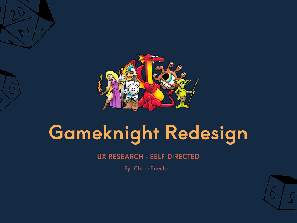
Gameknight Redesign Concept
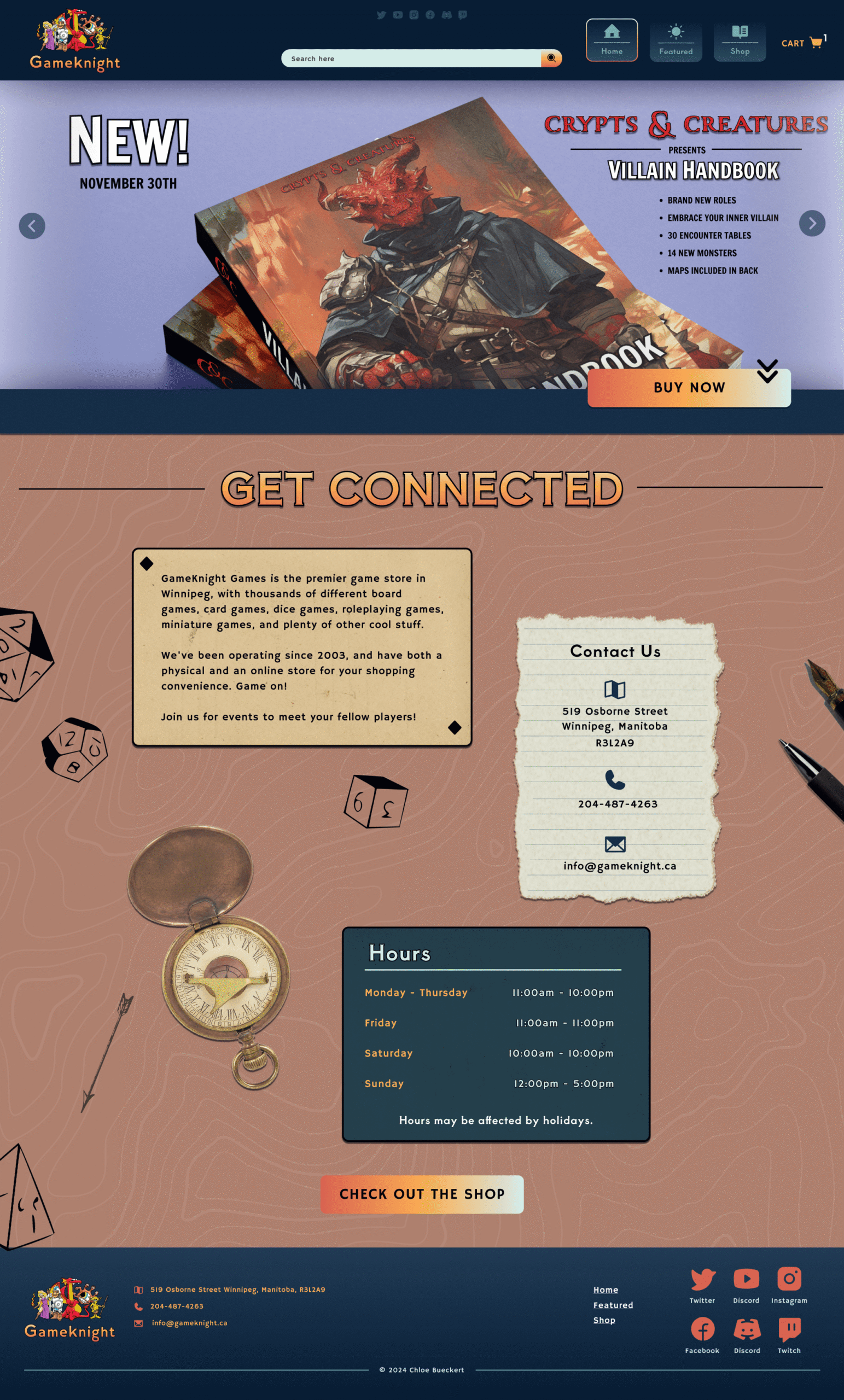
This project was a redesign for a local gaming store in Winnipeg. Since I have a background in comic books and playing tabletop role-playing games, I really wanted to see what I could come up for a store that caters to me as the customer.
I worked with a lot of graphic elements and worked with gradients when I noticed it in their original logo. I wanted the site to have this immediate realization of ‘oh, this is for the gamers’.
The homepage takes inspiration from a tabletop, with a simple background and shaded elements. It mixes between illustration and more realistic elements, as the line blends in these types of games.
The shop page has a ready available navigation on the side and is featured focusing on the section for tabletop role-playing. I had a lot of fun making book covers for this section and photoshopping the hero image.
The product page settles down and lets the product speak louder. I opted for a larger product image and came up with copy for the page. The breadcrumb trail at the top is meant to help users navigate and know where they currently are.
The mobile version is built in similar fashion and is intended to make browsing on your phone anytime easy and fun.
Mobile Finance Cards
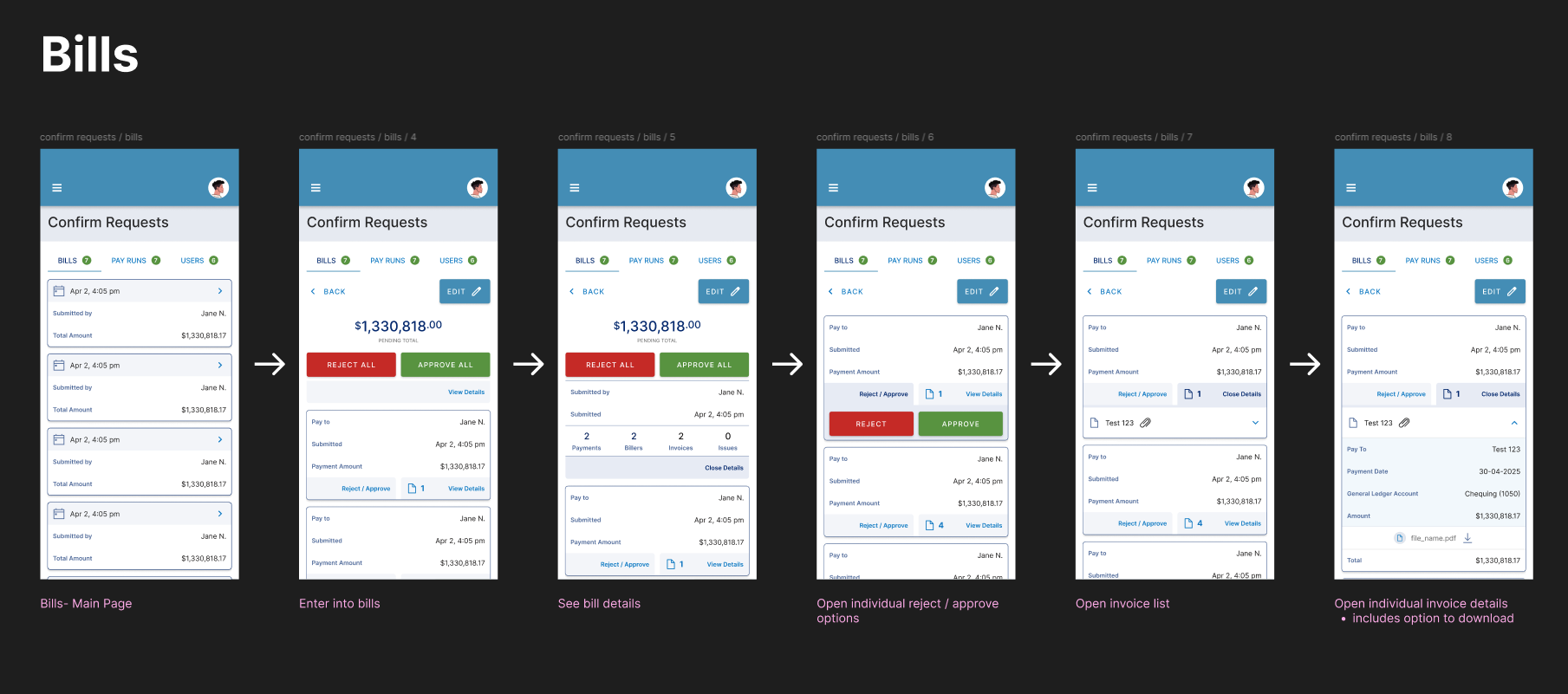
This was a project completed over my work placement and gave me insight into how the workplace looks for a UI / UX designer role. I worked on creating mobile cards for a financial application.
This meant that I had to really understand what was happening in the program and how to translate those options to the mobile view. Especially since you don’t want to limit options that are available on desktop. There were many meetings checking in and taking helpful comments about things that should stay or could be rearranged.
I started with many concepts that could fit each of the three pages to work on and narrowed them down through the help of fellow designers and related company. In the end, the cards were placed into a template and prototyped for a robust high fidelity version. The project made use of the design library associated with the company to see how it could translate to the mobile version. For the sake of showing this prototype, elements have been altered.
This project taught me a lot about how to structure components and how to build while keeping prototyping in mind. It also was a solid exercise in mobile sizing and learning how to handle large amounts of details on a small screen. It was a great introduction to the workforce and getting experience on taking feedback in a real setting.
Check out the prototype below!
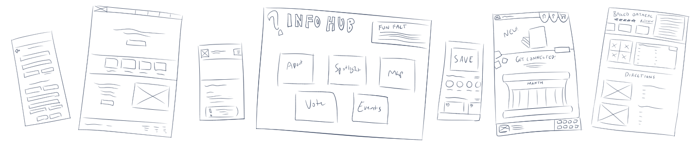
Assiniboine Zoo Kiosk Concept
This project was a concept for a kiosk at the Assiniboine Zoo. This was a group project where I got to take on a design role alongside another designer. I had a lot of fun with this one!
What made this project extra special was that we had access to these large screens which allowed me to test spacing and distance to buttons. There’s a lot that goes into larger screens!
We narrowed down a lot of what we decided to include based on the wireframes I made for the screens. We went with bright colours and a few animations and interactive dragging areas to make it interesting for viewers.
A lot of my focus went into how we wanted the designs to read and creating the wireframes and working prototype. It really tested my Figma prototyping skills and making components. I’m really happy with how everything turned out!
UX Testing for GameKnight Redesign
This user testing project goes through two initial user tests before coming up with solutions to one chosen problem. The solution was then tested through comparative testing to come to a final conclusion. I chose the Gameknight Redesign project I’d done prior, curious to see what type of feedback I’d receive from users.
I started with the ‘5 Second Test’ and had the users view the homepage for five seconds and then answer follow-up questions to gauge their thoughts on their impressions of the design.
Second came the Competitive Testing. Participants were shown three different local website designs for gaming stores, with the GameKnight redesign slotted in between them. The homepage, product search page, and product listing page were shown to gauge reactions to the designs.
Research was collected and analyzed for each of the three pages before deciding to focus on the homepage and the lack of event calendar. Two calendars were created, and then tested against each other to see what users liked and disliked about both.
In the end, the list calendar was the recommended choice.
This was the user experience project that really began to click what ux testing is all about. It was interesting to hear the responses of my participants and get some surprising feedback. It was fairly time-consuming but I ended up quite happy with the results.
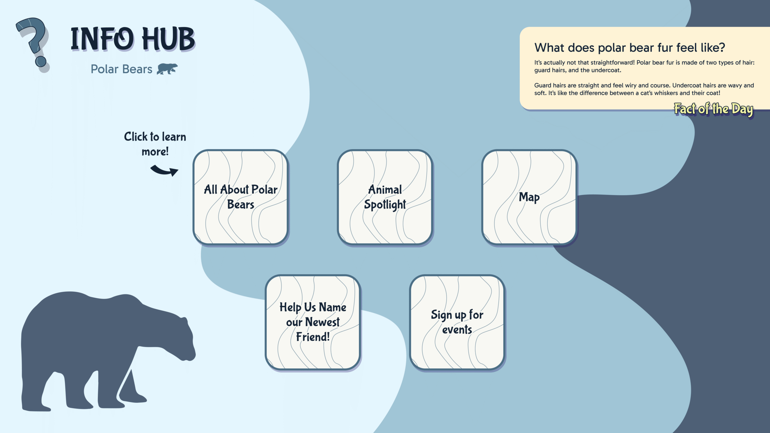
Studio Project – Morden Stanley Winkler Emergency Response
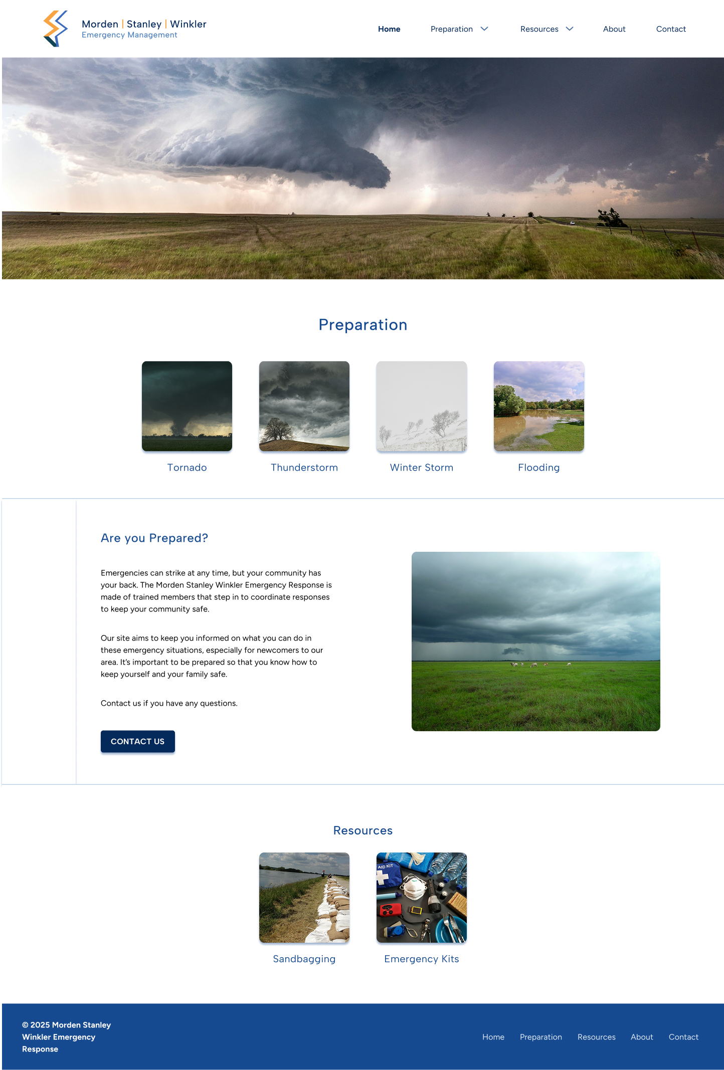
This project was a doozy! It starts with the Southern Emergency Response Committee. This organization acts as the in-between for municipal and provincial governments in emergencies. I’m familiar with it as my mother has been a part of it for several years and is currently their deputy.
I interviewed her and we narrowed down what could be added to the website. She focused on newcomers and lack of knowledge dealing with the weather of the region.
The biggest challenge was presenting the information in a way that would be readable and interesting. The second challenge was prototyping it together, of which majority of the prototype is interactive.
This project started out with the intention of coding it in WordPress, but I opted to focus on the design and really nail down the navigation and layout. For the mobile in particular, the quick links are bright red and obvious — easy to spot in an emergency.
This would be a great project for me to code someday in the future and I would love to return to it.
Write Right Animated Project
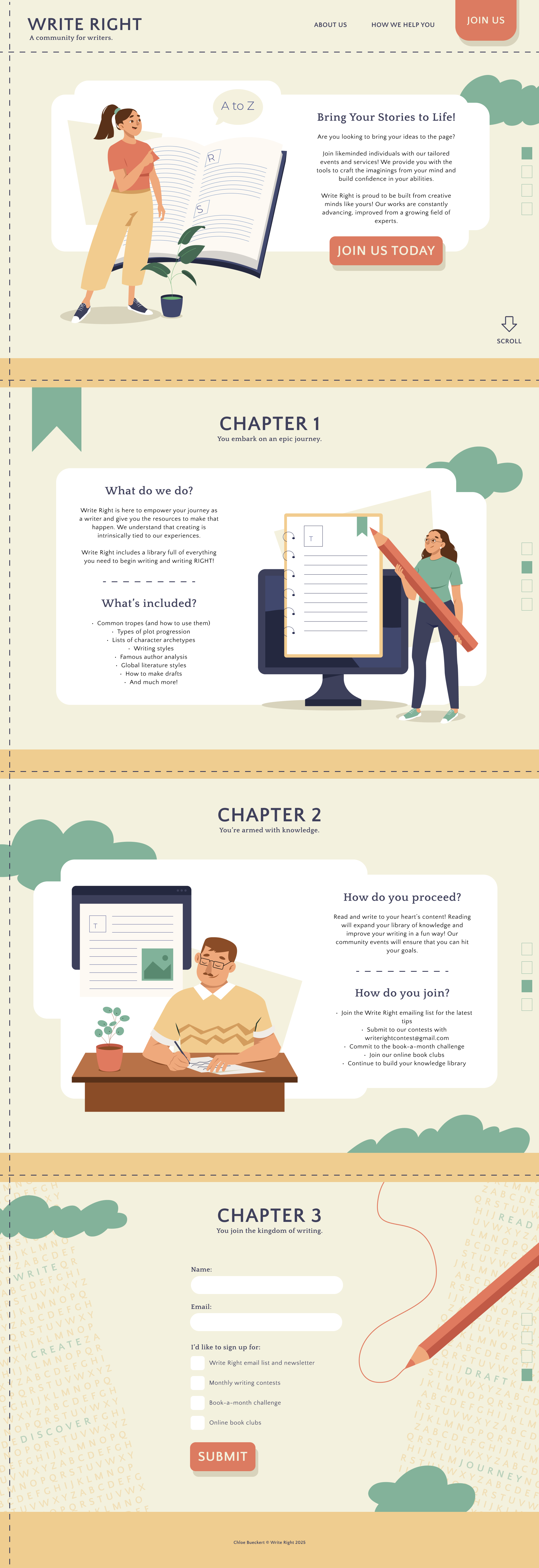
This college project covered an animated website from beginning to end. It started with finding illustrations and then putting together a design. I came up with the fictional community of ‘Write Right’, a place for writers new and old to learn or teach writing. I came up with the idea since I would’ve benefited from a community like that when I was younger.
The illustrations were prepped in Adobe Illustrator. From there, it went into Adobe After Effects and made use of the bodymovin plugin. The animations have a build phase and a seamless loop, and it ended up being really fun to animate!
For the coding, the animate on scroll library and Fullpage.js were used alongside the animations for fun bubbling into existence.
Overall, this was a very fun and challenging project that got to take me all over the process that goes into a website like this. I’m excited to revisit a website like this in the future.